LEARN MORE
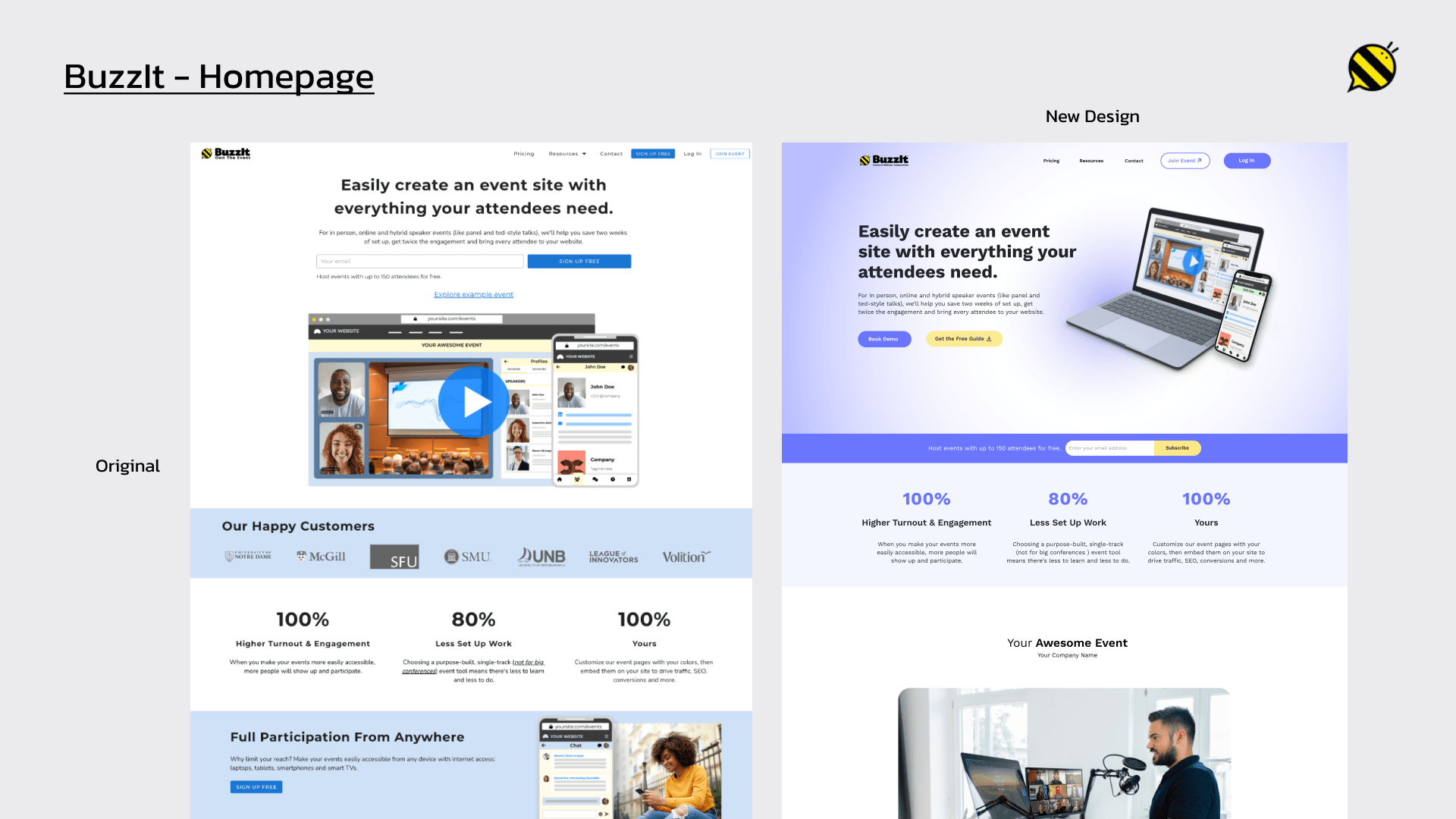
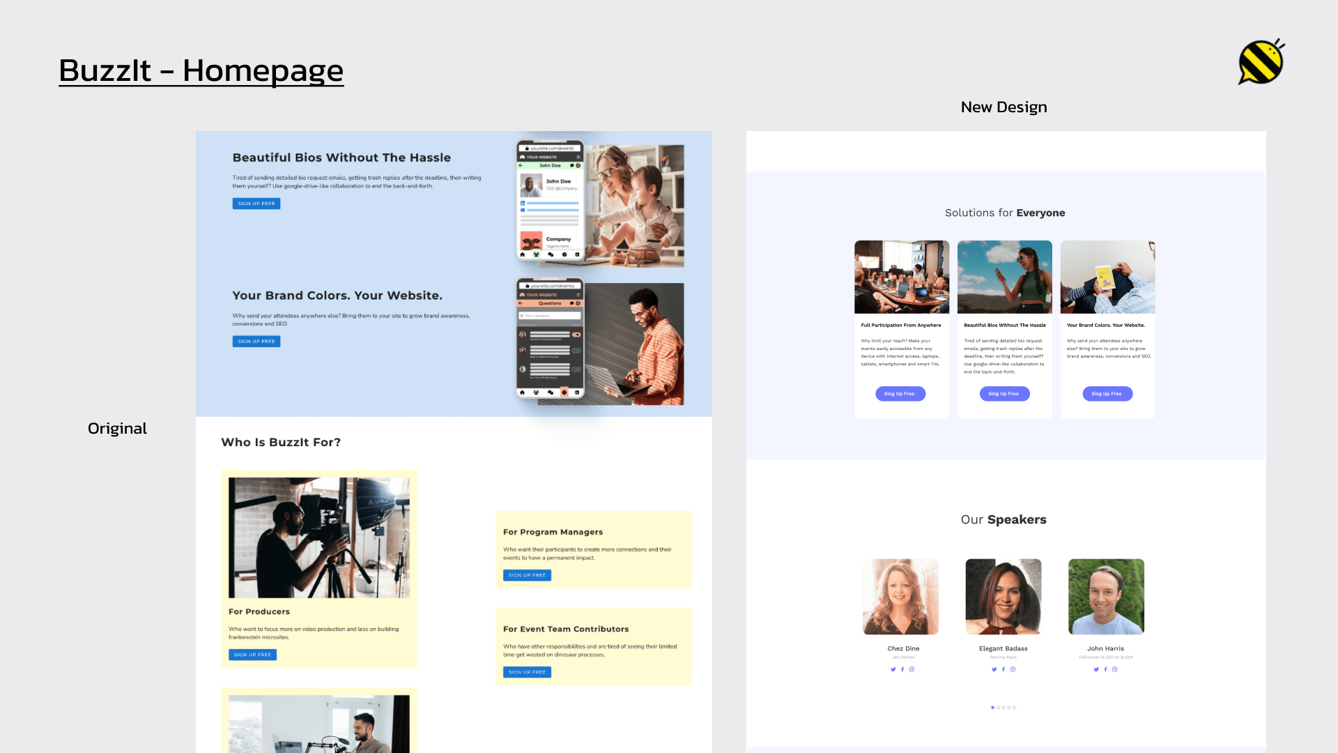
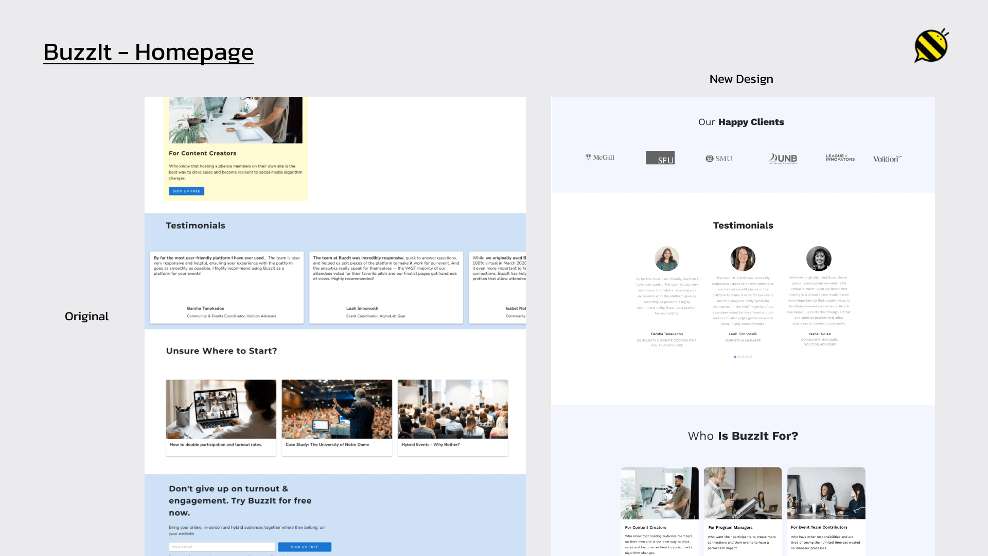
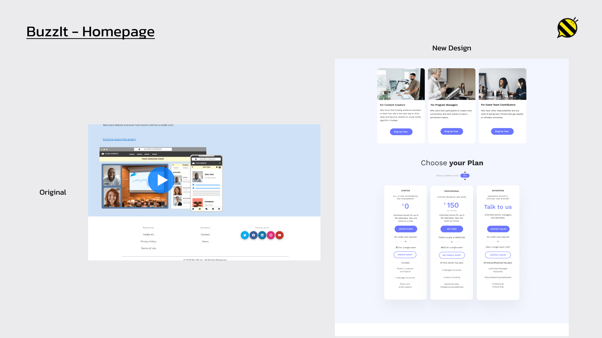
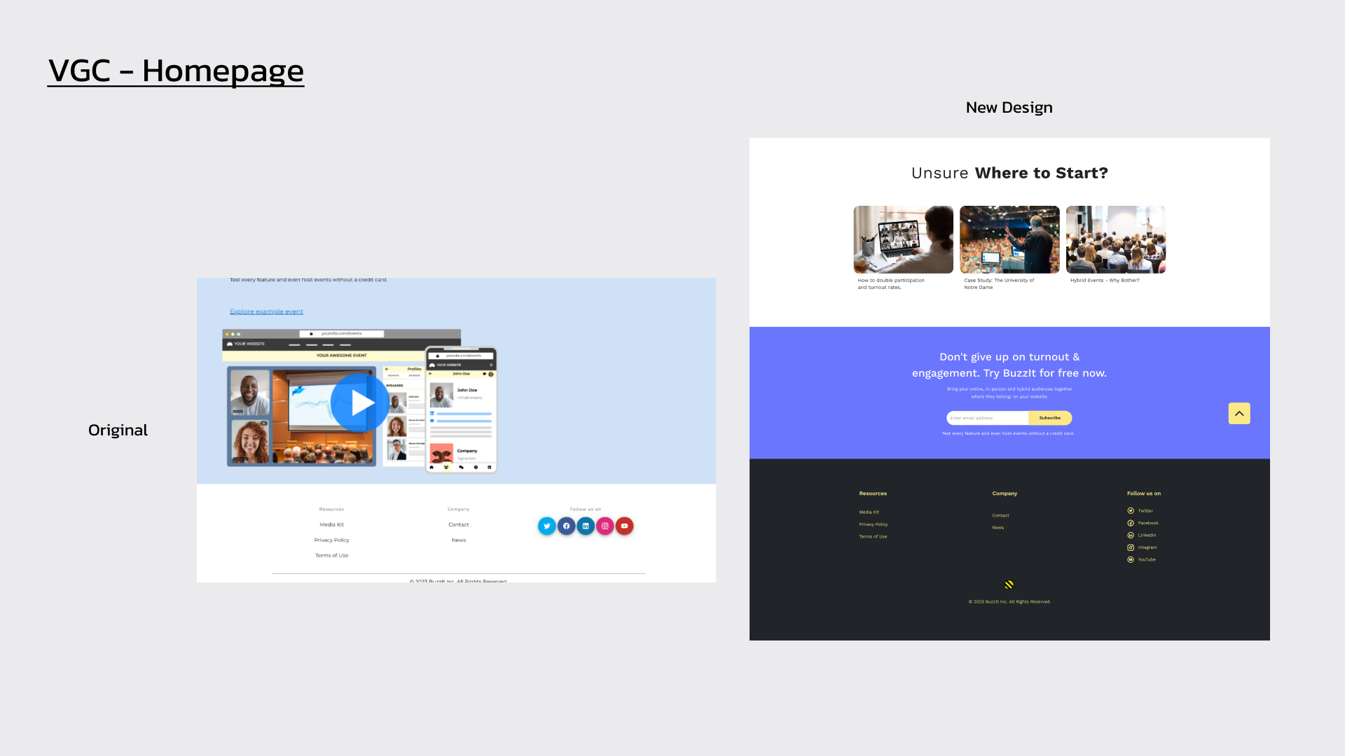
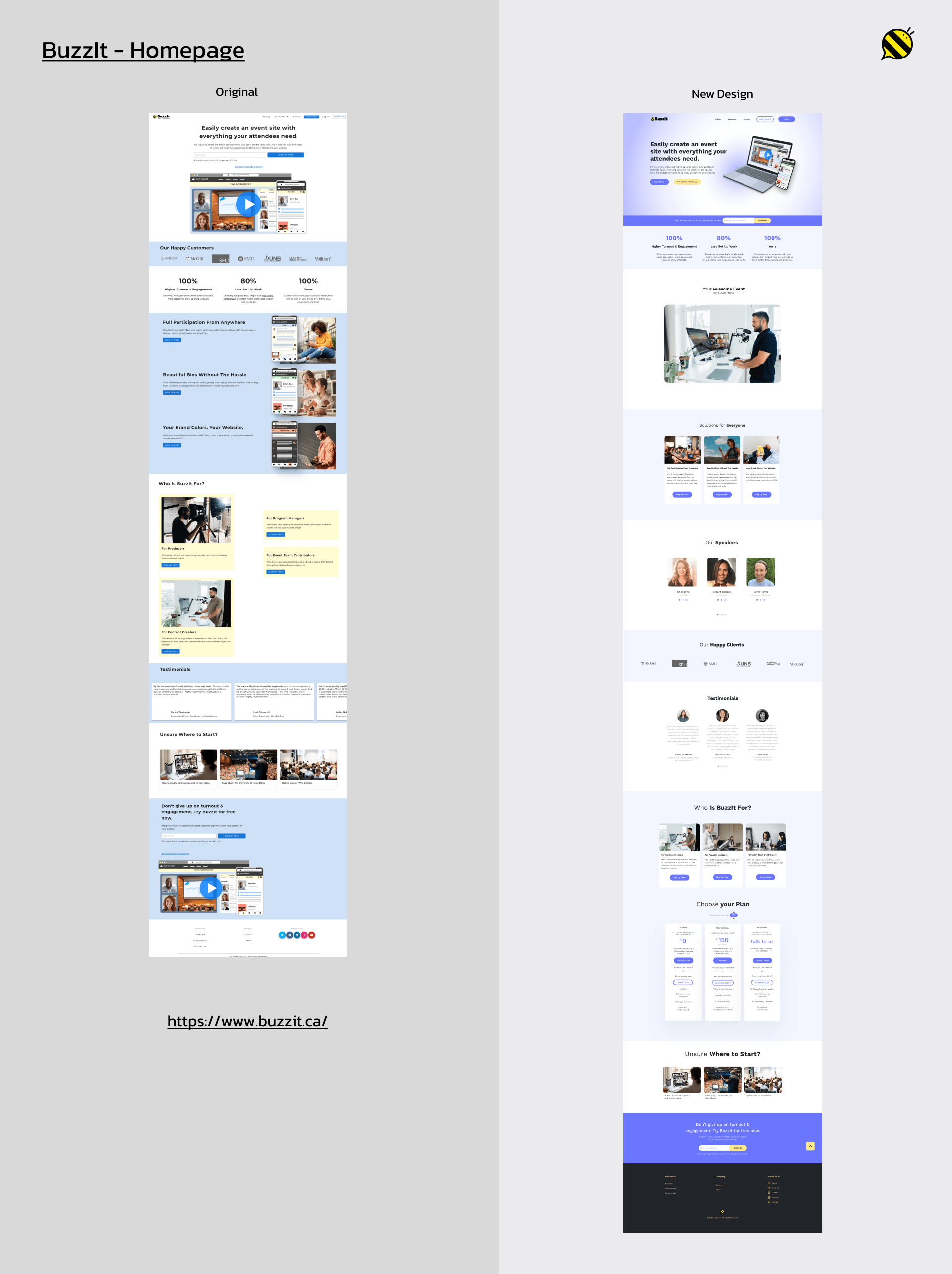
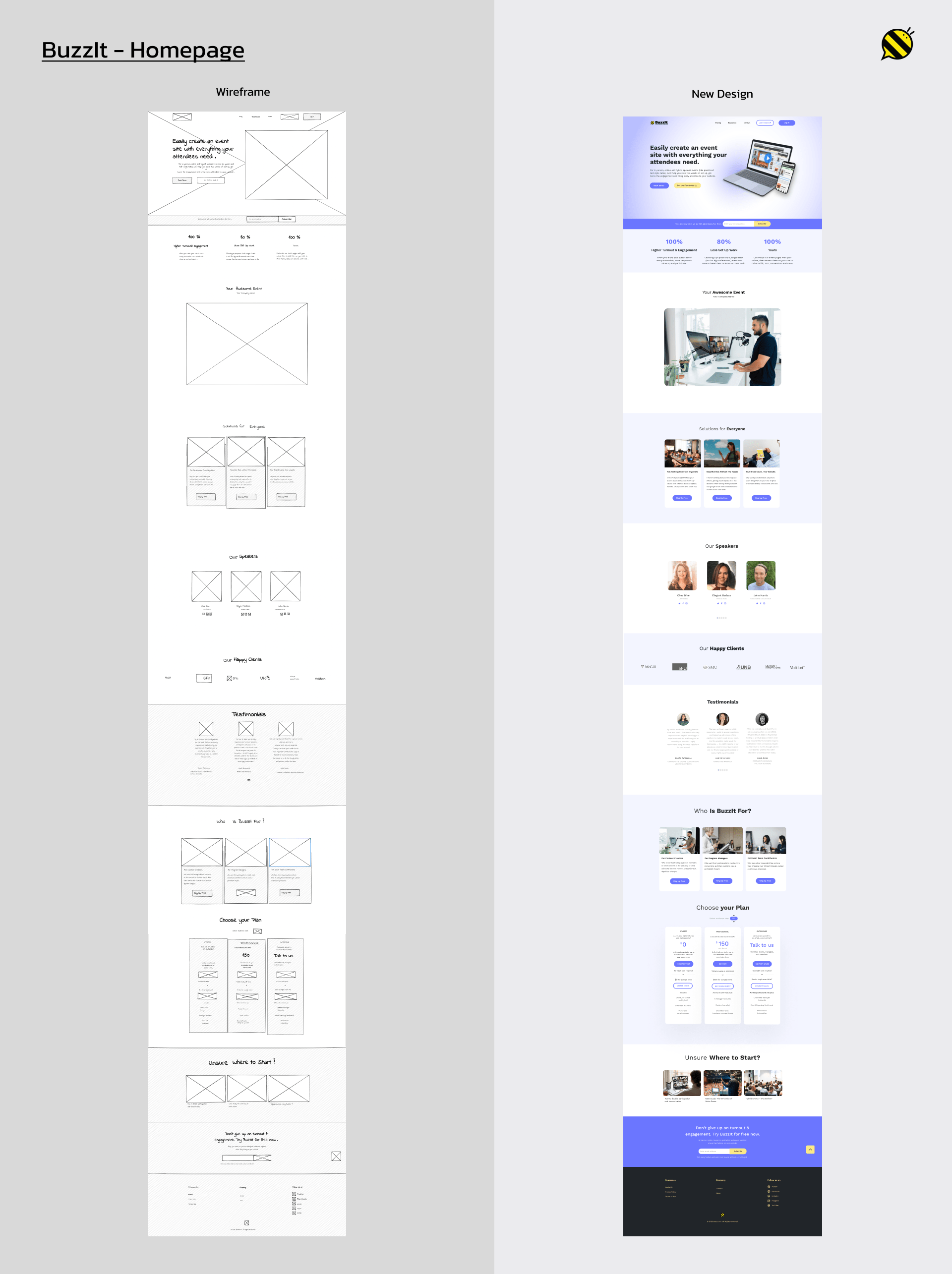
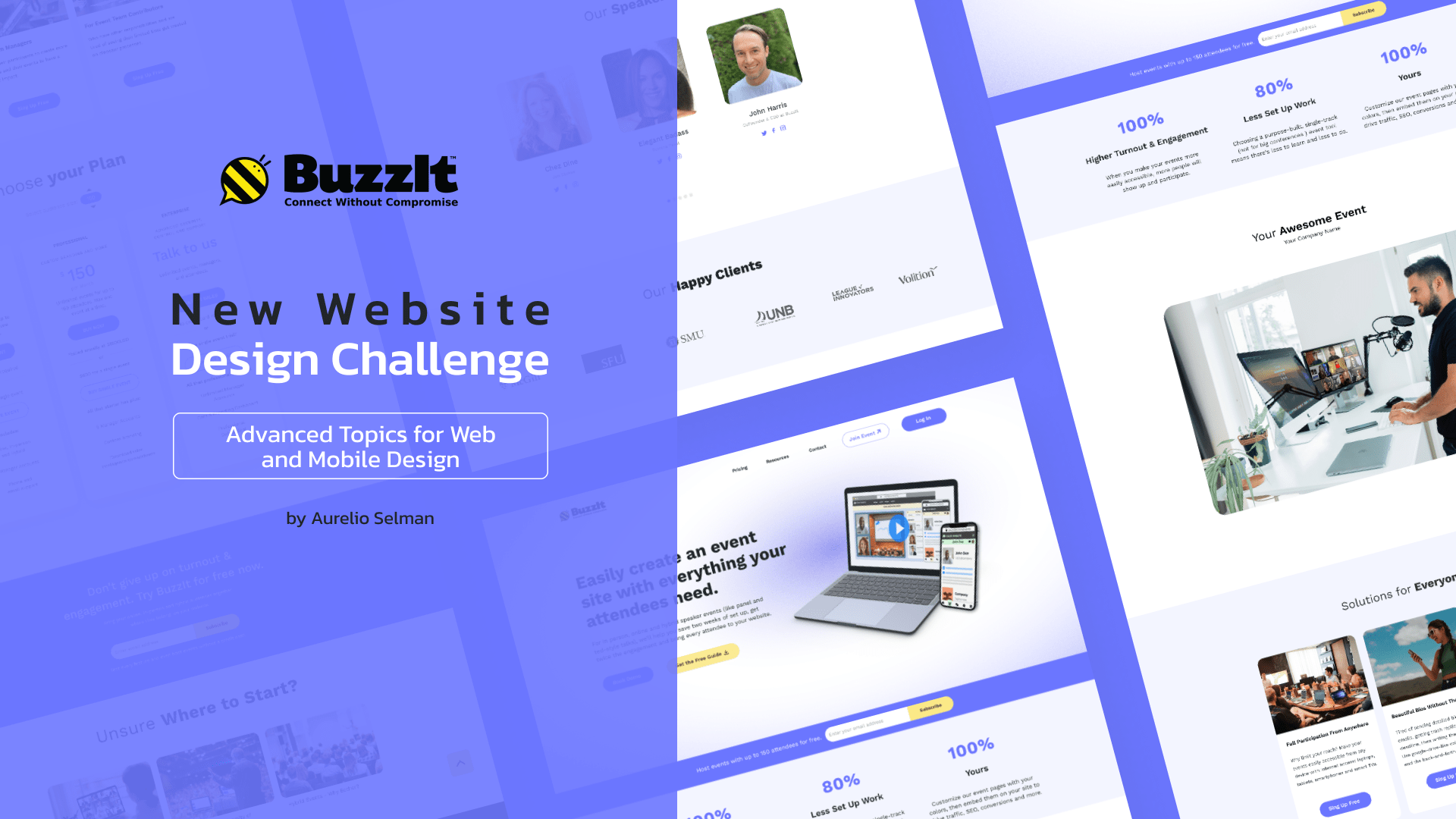
I redesigned the home page as part of Advanced Topics for Web and Mobile Design challenge.
BuzzIt - Own The Event
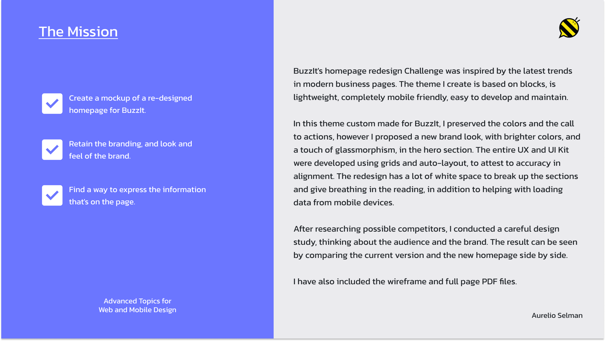
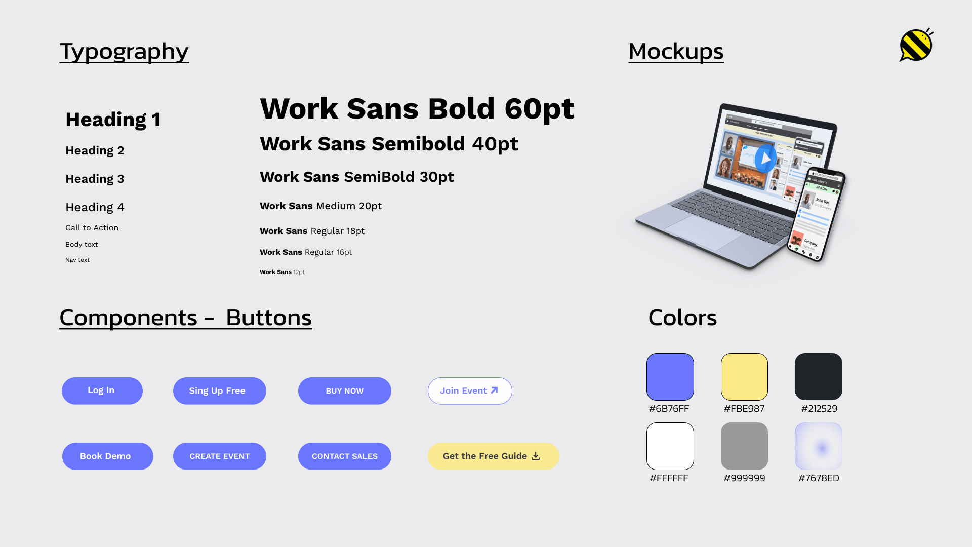
Their current website is way too busy, especially at the top. There is way too much text, content, and too many places for the eye to look at throughout the homepage. The mission was to create a mockup of a redesigned homepage, retain the branding, and look and feel of the brand.
Home » BuzzIt

